Enhancing Authorized User
Transaction Visibility
Making shared credit card usage clear and trustworthy for primary account holders in the Chase mobile app
Role
Lead UX Designer
Timeline
8 weeks (2024)
Team
Cross-functional pod
including 1 UX
Researcher, 1 Product
Manager, 2 Engineers,
Legal & Compliance
Stakeholders
Tools
Figma
Miro
InVision
Jira
MDC
My Task
I was responsible for:
• Problem framing and journey mapping
• Competitive benchmarking
• Wireframes and visual design
• Prototyping and user testing
• Final documentation and engineer handoff
Objective
Design a scalable and intuitive multi-card transaction experience that enhances financial control and accountability while maintaining brand consistency and security compliance.
Design Goals
Surface authorized user information clearly
Differentiate activity by cardholder
Enhance financial control and accountability
Feel premium and personalized for Chase's
Affluent customer segment
Key Problem
"I see a transaction I don't recognize. Was this me or someone else on the account?"
Primary cardholders in multi-card households frequently encountered this issue. The interface showed only the last 4 digits of a card number, which often wasn't enough to distinguish among multiple Chase cards (especially if the digits were similar). With no sort or filter functionality by cardholder, users had to manually dig through each transaction detail.
Confusion
Users couldn't identify cardholders
Support Calls
Unnecessary servicing burden
Mistrust
Frustration in multi-user households
Strategic Opportunities
Surface cardholder identity in real time:
Not just in statements or alerts
Add sorting & filtering by user:
Help users track spending by individual
Humanize shared finances:
Acknowledge that financial relationships are complex
Elevate trust:
Transform the app from a transactional tool to a trust-building experience
Support family budgeting use cases:
Let households reconcile purchases with clarity and speed
Project Success Factors
Cross-functional Collaboration
Regular sync meetings with legal,
engineering, and product teams
ensured alignment throughout the
process.
User-Centered Approach
Continuous user feedback loops at
every stage prevented costly late-
stage changes.
Agile Methodology
Rapid prototyping and testing
cycles allowed for quick iteration
and validation.
Lead the redesign of the transaction history and details screens in Chase's mobile app to solve a recurring problem reported by primary cardholders: lack of visibility into which household member (i.e., authorized user) made a given purchase. The goal was to improve clarity and build trust without adding friction or overwhelming the interface.
Competitive Analysis
Apple Card
Strengths
• Elegant, merchant-centered
design
• Strong transaction detail
clarity
• Excellent branding integration
American Express
Strengths
• Monthly statements show AU
info
• Joint account clarity in
desktop
• Strong customer service
integration
Defining Success
UX Success Metrics
Users can correctly identify the cardholder
for any transaction within 5 seconds
90% of users express increased trust in
managing AU transactions
Transaction clarity becomes a highlight in
user feedback
Business Success Metrics
Reduce support calls regarding
"unrecognized transactions"
Increase NPS for shared-card users
Expand adoption of AU features due to
improved trust
Constraints & Risks
Legal Compliance
User name display must meet privacy and data-handling
regulations; especially in joint or child-user contexts
Mitigation: Worked closely with legal team to ensure
compliance while maintaining clarity
MDS Component Library
Chase's mobile component system limited the
customization of list rows, filters, and transaction details
Mitigation: Worked within constraints to create elegant
solutions using existing components
Back-end Data Integrity
Transaction-to-user mapping logic required validation
across edge cases (e.g., refunds, split payments)
Mitigation: Collaborated with engineering to ensure data
accuracy and handle edge cases
Clarity vs. Clutter
Adding names could overpopulate screens or increase
complexity if not introduced gracefully
Mitigation: Careful visual hierarchy and typography to
maintain clean interface
Research Themes / Qualitative Insights
User Journey Map: Sarah's Transaction Review Experience
80+
Support call transcripts
reviewed
12
User interviews conducted
10
Usability testing with
interactive prototype
Trust & Control
"I need to know exactly who used the card—immediately."
Primary cardholders expressed frustration with the detective work required to identify transactions, leading to unnecessary
family conflicts.
Household Reconciliation
"We split groceries and errands—this needs to be visible."
Families wanted to track spending by individual for budgeting and teaching financial responsibility to children.
Cognitive Load
"Matching charges to people is mentally draining with just numbers."
Users spent significant mental energy decoding card numbers and cross-referencing with family members' spending
patterns.
Mobile Expectation
"I don't check a PDF statement anymore. I expect this info on my phone."
Users expected real-time cardholder attribution in the mobile app, not just in monthly statements.
Current State: Frustrating Detective Work
Opens App
Checks transactions during
morning coffee
Neutral
Routine check
1
1
2
2
3
3
4
5
Spots Unknown
Charge
Sees "$67.43 - AMAZON"
but doesn't remember
ordering
Confused
"Was this me?"
Investigates
Taps transaction, sees only
"Card ending in 4000"
Frustrated
"Still no clarity"
Contacts Family
Texts husband and kids:
"Did anyone order from
Amazon?"
Annoyed
"Playing detective again"
Gets Answer
Son replies: "Yeah, I bought
a textbook for class"
Relieved but tired
"Why was this so hard?"
Pain Points
• 5-10 minutes wasted on detective work
• Interrupts family members unnecessarily
• Creates tension around spending
• Happens 2-3 times per week
Future State: Clear and Confident
Opens App
Checks transactions during morning coffee
Positive
Routine check
Sees Clear Attribution
Sees "$67.43 - AMAZON" with "MICHAEL
RODRIGUEZ" below
Satisfied
"Ah, Michael's textbook"
Continues Review
Quickly scans other transactions with
confidence
Confident
"Everything makes sense"
Benefits
• Instant clarity - no investigation needed
• No interruption to family members
• Builds trust in shared spending
• Saves 5-10 minutes per session
Key Journey Insights
Emotional Impact
The current experience transforms a routine financial
check into a stressful detective exercise, creating
unnecessary friction in family relationships.
Opportunity
By providing immediate cardholder attribution, we can
eliminate the investigation phase entirely and transform
confusion into confidence.
Wireframe Evolution
The design evolved through multiple iterations, each addressing specific user needs and technical constraints
while maintaining Chase's design standards.
Initial Concept
Concept Goals
Add cardholder name as secondary information
below merchant
Maintain existing visual hierarchy
Use blue accent color to distinguish cardholder
info
Feedback
"Card: Elizabeth A. Meiers" felt too technical and
formal. Users wanted more natural language.
CREDIT CARD (...5555)
STARBUCKS
Card: Elizabeth A. Meiers
$9.02
GRUBHUB
Card: Primary Account
$57.36
Initial wireframe concept
Iteration 1: Simplified Language
Changes Made
Removed "Card:" prefix for cleaner appearance
Changed color to subtle gray to reduce visual
noise
Simplified "Primary Account" language
User Feedback
Better, but users still wanted filtering capability and
questioned if full names were necessary.
CREDIT CARD (...4000)
STARBUCKS
Elizabeth A. Meiers
$9.02
GRUBHUB
Primary Account
$57.36
Iteration 1 wireframe
Iteration 2: Adding Filters
Key Additions
Added filter dropdown for "All Cards"
Shortened names to first name + last initial
Simplified primary account to just "Primary"
Technical Constraint
Legal team required full names for compliance. Filter
label needed to be more specific.
Showing
All Cards ▼
STARBUCKS
Elizabeth M.
$9.02
GRUBHUB
Primary
$57.36
Iteration 2 wireframe
Final Design: Compliance & Clarity
Final Refinements
Full names in caps to match Chase's data format
Filter shows specific card for clarity
Blue color maintains Chase brand consistency
Meets legal compliance requirements
Success Metrics
100% task completion rate in usability testing. Users
could identify cardholders in under 5 seconds.
Showing
Credit Card (...4000) ▼
4th Ave Deli Grill
ELIZABETH A MEIERS
$3.12
STARBUCKS
ELIZABETH A MEIERS
$9.02
Final wireframe
Design Principles Applied Throughout
Progressive Enhancement
Each iteration built upon user feedback while
maintaining core functionality
Constraint-Driven Design
Legal and technical requirements shaped solutions
rather than limiting them
User-Centered Iteration
Every change was validated through user testing and
feedback
Brand Consistency
Maintained Chase's visual language while improving
functionality
Concept Testing & Quantitative Data
Test Group
10 mobile banking users (5 primary, 5 AU
households)
Method
Interactive prototype testing via InVision with
task-based scenarios
Key Tasks
• Identify who made a specific transaction
• Filter transactions by cardholder
• Navigate to transaction details
• Express trust level in shared card usage
Iteration
Changes based on feedback:
User Feedback
• 1 flagged that full names felt "a little formal"
• Users wanted more natural language
• Filter menu needed clearer labeling
Design Changes
• Reduced full middle names to preferred first + last
• Added iconography next to AU name to aid scanning
• Clarified filter menu label to "Cardholder" instead of
"Credit Card"
• Ensured interaction followed ADA/WCAG guidelines
Legal Constraint Override
Despite user preference for shortened names, legal team required full names for compliance. Final design maintained full names but improved visual hierarchy and tone.
UX Impact
Task Completion
100% of users could identify cardholders within 5 seconds
Trust Improvement
User Feedback
Business Metrics
Pilot Launch
15% of AU accounts
NPS Increase
+8 points
Support Call Reduction
-30%
Strategic Impact
This project demonstrated the value of user-centered design in financial services and became a template for future
family-focused features across Chase's product portfolio.
Outcomes
Reflection
"Design is clarity. Clarity is trust. And trust is the product."
What Made This Meaningful
This project showed how UX can influence human
relationships. Financial tools should remove
ambiguity, not add to it. By surfacing AU identity
clearly and confidently, we not only improved
functionality — we gave people a better way to
manage trust.
The most rewarding moment was hearing a user
say they'd "finally stop calling my kid every
week." That's when I knew we'd solved a real
human problem, not just a technical one.
What I'd Do Differently
I would have involved the legal team earlier in the
design process to avoid late-stage constraints
around name display. Earlier collaboration could
have led to more creative solutions that balanced
compliance with user preferences.
I'd also explore more progressive disclosure
options for cardholder information, allowing users
to choose their preferred level of detail based on
their family dynamics.
Enhancing Authorized User
Transaction Visibility
Making shared credit card usage clear and trustworthy for primary account holders in the Chase mobile app
Role
Lead UX Designer
Timeline
8 weeks (2024)
Platform
Chase iOS and Android apps
Team
• 1 UX Researcher
• 1 Product Manager
• 2 Engineers
• Legal & Compliance Stakeholders
Tools
Figma
Miro
InVision
Jira
MDC
Project Success Factors
Cross-functional
Collaboration
Regular sync meetings with
legal, engineering, and
product teams ensured
alignment throughout the
process.
User-Centered Approach
Continuous user feedback
loops at every stage
prevented costly late-stage
changes.
Agile Methodology
Rapid prototyping and testing
cycles allowed for quick
iteration and validation.
My Task
Lead the redesign of the transaction history and details screens in Chase's mobile app to solve
a recurring problem reported by primary cardholders: lack of visibility into which household
member (i.e., authorized user) made a given purchase. The goal was to improve clarity and build
trust without adding friction or overwhelming the interface.
I was responsible for:
• Problem framing and journey mapping
• Competitive benchmarking
• Wireframes and visual design
• Prototyping and user testing
• Final documentation and engineer handoff
Objective
Design a scalable and intuitive multi-card transaction experience that enhances financial
control and accountability while maintaining brand consistency and security compliance.
Design Goals
Surface authorized user information clearly
Differentiate activity by cardholder
Enhance financial control and accountability
Feel premium and personalized for Chase's Affluent customer segment
Key Problem
"I see a transaction I don't recognize. Was this me or someone else
on the account?"
Primary cardholders in multi-card households frequently encountered this issue. The
interface showed only the last 4 digits of a card number, which often wasn't enough
to distinguish among multiple Chase cards (especially if the digits were similar). With
no sort or filter functionality by cardholder, users had to manually dig through each
transaction detail.
Confusion
Users couldn't identify
cardholders
Support Calls
Unnecessary servicing
burden
Mistrust
Frustration in multi-user
households
Competitive Analysis
Apple Card
Strengths
• Elegant, merchant-
centered design
• Strong transaction
detail clarity
• Excellent branding
integration
Gap
Doesn't distinguish
shared spending or
cardholder identity
American Express
Strengths
• Monthly statements
show AU info
• Joint account clarity
in desktop
• Strong customer
service integration
Gap
Mobile UI doesn't
show cardholder at
the transaction level
Defining Success
UX Success Metrics
Users can correctly identify the
cardholder for any transaction
within 5 seconds
90% of users express increased
trust in managing AU transactions
Transaction clarity becomes a
highlight in user feedback
Business Success Metrics
Reduce support calls regarding
"unrecognized transactions"
Increase NPS for shared-card users
Expand adoption of AU features
due to improved trust
Constraints & Risks
Legal Compliance
User name display must meet privacy and
data-handling regulations; especially in
joint or child-user contexts
Mitigation: Worked closely with legal
team to ensure compliance while
maintaining clarity
MDC Component Library
Chase's mobile component system limited
the customization of list rows, filters, and
transaction details
Mitigation: Worked within constraints to
create elegant solutions using existing
components
Back-end Data Integrity
Transaction-to-user mapping logic
required validation across edge cases
(e.g., refunds, split payments)
Mitigation: Collaborated with engineering
to ensure data accuracy and handle edge
cases
Clarity vs. Clutter
Adding names could overpopulate screens
or increase complexity if not introduced
gracefully
Mitigation: Careful visual hierarchy and
typography to maintain clean interface
Research Themes / Qualitative Insights
80+
Support call
transcripts reviewed
12
User interviews
conducted
10
Usability testing with
interactive prototype
Trust & Control
"I need to know exactly who used the card—immediately."
Primary cardholders expressed frustration with the detective work required to identify
transactions, leading to unnecessary family conflicts.
Household Reconciliation
"We split groceries and errands—this needs to be visible."
Families wanted to track spending by individual for budgeting and teaching financial
responsibility to children.
Cognitive Load
"Matching charges to people is mentally draining with just numbers."
Users spent significant mental energy decoding card numbers and cross-referencing with
family members' spending patterns.
Mobile Expectation
"I don't check a PDF statement anymore. I expect this info on my phone."
Users expected real-time cardholder attribution in the mobile app, not just in monthly
statements.
Design Criteria Themes
Clear
Replace ambiguous digits with recognizable
names
Applied in: List view, detail screen
Transparent
Show attribution immediately, not after taps
Applied in: Inline metadata
Approachable
Use tone that implies shared ownership, not
blame
Applied in: Tooltip, copywriting
Personalized
Reflect how people actually manage family
spending
Applied in: Filter by cardholder
Design Process
CREDIT CARD (...5555)
9:41
Search or filter
Sep 15, 2023
4TH AVE DELI GRILL
Pending
$3.12
STUDENT FOOD CORP - MEALS
Food & drink (...6272)
$302.56
WERKSTATT
Food & drink
159.81
Sep 14, 2023
METROPOLITAN TRANSPORTATION
Transportation (...2908)
$2.90
STARBUCKS
Food & drink
$9.02
GRUBHUB
Food & drink
$57.36
Sep 13, 2023
DANDELION CHOCOLATES
Food & drink
$77.77
BLUE BOTTLE COFFEE
Food & drink
$6.45
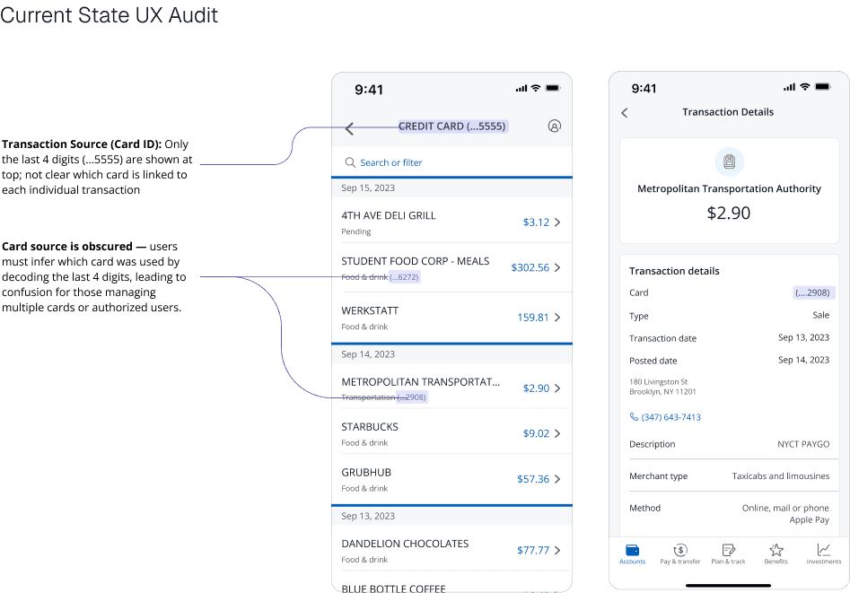
Card source is obscured — users must infer which card was used by decoding the last 4 digits, leading to confusion for those managing multiple cards or authorized users.
Transaction Source (Card ID): Only the last 4 digits (...5555) are shown at top; not clear which card is linked to each individual transaction
Transaction Details
Accounts
Pay & transfer
Plan & track
Benefits & Travel
More
9:41

Metropolitan Transportation Authority
$2.90
Transaction details
Card
Card
Type
Transaction date
Posted date
180 Livingston St
Brooklyn, NY 11201
(....2908)
Sale
Sep 13, 2023
Sep 14, 2023
(347) 643-7413
Description
NYCT PAYGO
Merchant type
Taxicabs and limousines
Method
Online, mail or phone
Apple Pay
Description
NYCT PAYGO
Wireframe Evolution
The design evolved through multiple iterations, each addressing specific user needs and
technical constraints while maintaining Chase's design standards.
Initial Concept
CREDIT CARD (...5555)
STARBUCKS
Card: Elizabeth A. Meiers
$9.02
GRUBHUB
Card: Primary Account
$57.36
Initial wireframe concept
Concept Goals
Add cardholder name as secondary
information below merchant
Maintain existing visual hierarchy
Use blue accent color to distinguish
cardholder info
Feedback
"Card: Elizabeth A. Meiers" felt too technical
and formal. Users wanted more natural
language.
Iteration 1: Simplified Language
CREDIT CARD (...4000)
STARBUCKS
Elizabeth A. Meiers
$9.02
GRUBHUB
Primary Account
$57.36
Iteration 1 wireframe
Changes Made
Removed "Card:" prefix for cleaner
appearance
Changed color to subtle gray to reduce
visual noise
Simplified "Primary Account" language
User Feedback
Better, but users still wanted filtering
capability and questioned if full names were
necessary.
Iteration 2: Adding Filters
Showing
All Cards ▼
STARBUCKS
Elizabeth M.
$9.02
GRUBHUB
Primary
$57.36
Iteration 2 wireframe
Key Additions
Added filter dropdown for "All Cards"
Shortened names to first name + last
initial
Simplified primary account to just
"Primary"
Technical Constraint
Legal team required full names for
compliance. Filter label needed to be more
specific.
Final Design: Compliance & Clarity
Showing
Credit Card (...4000) ▼
4th Ave Deli Grill
ELIZABETH A MEIERS
$3.12
STARBUCKS
ELIZABETH A MEIERS
$9.02
Final wireframe
Final Refinements
Full names in caps to match Chase's data
format
Filter shows specific card for clarity
Blue color maintains Chase brand
consistency
Meets legal compliance requirements
Success Metrics
100% task completion rate in usability
testing. Users could identify cardholders in
under 5 seconds.
Design Principles Applied Throughout
Progressive Enhancement
Each iteration built upon user feedback while
maintaining core functionality
Constraint-Driven Design
Legal and technical requirements shaped
solutions rather than limiting them
User-Centered Iteration
Every change was validated through user
testing and feedback
Brand Consistency
Maintained Chase's visual language while
improving functionality
Concept Testing & Quantitative Data
Test Group
10 mobile banking users (5 primary, 5
AU households)
Method
Interactive prototype testing via
InVision with task-based scenarios
Key Tasks
• Identify who made a specific
transaction
• Filter transactions by cardholder
• Navigate to transaction details
• Express trust level in shared card
usage
Iteration
Changes based on feedback:
User Feedback
• 1 flagged that full names felt "a little
formal"
• Users wanted more natural language
• Filter menu needed clearer labeling
Design Changes
• Reduced full middle names to preferred
first + last
• Added iconography next to AU name to
aid scanning
• Clarified filter menu label to "Cardholder"
instead of "Credit Card"
• Ensured interaction followed ADA/WCAG
guidelines
Legal Constraint Override
Despite user preference for shortened names, legal team required full names for
compliance. Final design maintained full names but improved visual hierarchy and tone.
Final Concept
CREDIT CARD (...5555)
9:41
Search or filter
Sep 15, 2023
4TH AVE DELI GRILL
Pending
$3.12
STUDENT FOOD CORP - MEALS
Food & drink (...6272)
$302.56
WERKSTATT
Food & drink
159.81
Sep 14, 2023
METROPOLITAN TRANSPORTATION
Transportation (...2908)
$2.90
STARBUCKS
Food & drink
$9.02
GRUBHUB
Food & drink
$57.36
Sep 13, 2023
DANDELION CHOCOLATES
Food & drink
$77.77
BLUE BOTTLE COFFEE
Food & drink
$6.45
Card source is obscured — users must infer which card was used by decoding the last 4 digits, leading to confusion for those managing multiple cards or authorized users.
Transaction Source (Card ID): Only the last 4 digits (...5555) are shown at top; not clear which card is linked to each individual transaction
Transaction Details
Accounts
Pay & transfer
Plan & track
Benefits & Travel
More
9:41
Metropolitan Transportation Authority
$2.90
Transaction details
Card
Card
Type
Transaction date
Posted date
180 Livingston St
Brooklyn, NY 11201
(....2908)
Sale
Sep 13, 2023
Sep 14, 2023
(347) 643-7413
Description
NYCT PAYGO
Merchant type
Taxicabs and limousines
Method
Online, mail or phone
Apple Pay
Description
NYCT PAYGO
Outcomes & Impact
Business Metrics
Pilot Launch
15% of AU accounts
NPS Increase
+8 points
Support Call Reduction
-30%
UX Impact
Task Completion
100% of users could identify
cardholders within 5 seconds
Trust Improvement
90% reported increased confidence in
shared card management
User Feedback
Transaction clarity became a highlight
in user satisfaction surveys
Strategic Impact
This project demonstrated the value of user-centered design in financial services and
became a template for future family-focused features across Chase's product portfolio.
"Design is clarity. Clarity is trust. And trust is the product."
What Made This Meaningful
This project showed how UX can
influence human relationships. Financial
tools should remove ambiguity, not add
to it. By surfacing AU identity clearly and
confidently, we not only improved
functionality — we gave people a better
way to manage trust.
The most rewarding moment was
hearing a user say they'd "finally stop
calling my kid every week." That's when I
knew we'd solved a real human problem,
not just a technical one.
What I'd Do Differently
I would have involved the legal team
earlier in the design process to avoid
late-stage constraints around name
display. Earlier collaboration could have
led to more creative solutions that
balanced compliance with user
preferences.
I'd also explore more progressive
disclosure options for cardholder
information, allowing users to choose
their preferred level of detail based on
their family dynamics.
Enhancing
Authorized User
Transaction
Visibility
Making shared credit card usage
clear and trustworthy for primary
account holders in the Chase
mobile app
Role
Lead UX Designer
Timeline
8 weeks (2024)
Platform
Chase iOS and Android apps
Team
• 1 UX Researcher
• 1 Product Manager
• 2 Engineers
• Legal & Compliance Stakeholders
Tools
Figma
Miro
InVision
Jira
MDC
My Task
Lead the redesign of the transaction history
and details screens in Chase's mobile app
to solve a recurring problem reported by
primary cardholders: lack of visibility into
which household member (i.e., authorized
user) made a given purchase. The goal was
to improve clarity and build trust without
adding friction or overwhelming the
interface.
I was responsible for:
• Problem framing and journey
mapping
• Competitive benchmarking
• Wireframes and visual design
• Prototyping and user testing
• Final documentation and engineer
handoff
Objective
Design a scalable and intuitive multi-card
transaction experience that enhances
financial control and accountability while
maintaining brand consistency and security
compliance.
Design Goals
Surface authorized user information
clearly
Differentiate activity by cardholder
Enhance financial control and
accountability
Maintain brand consistency and security
compliance
Key Problem
"I see a transaction I don't
recognize. Was this me or
someone else on the
account?"
Primary cardholders in multi-card
households frequently
encountered this issue. The
interface showed only the last 4
digits of a card number, which
often wasn't enough to distinguish
among multiple Chase cards
(especially if the digits were
similar). With no sort or filter
functionality by cardholder, users
had to manually dig through each
transaction detail.
Confusion
Users couldn't identify
cardholders
Support Calls
Unnecessary servicing burden
Mistrust
Frustration in multi-user
households
Competitive Analysis
Apple Card
Strong transaction clarity but doesn't distinguish
shared spending
American Express
Shows AU info in statements but not in mobile
transaction view
Chase's Opportunity
Become the most transparent, family-ready
credit card app among legacy banks
Defining Success
UX Success Metrics
Users can correctly identify the
cardholder for any transaction
within 5 seconds
90% of users express increased
trust in managing AU transactions
Transaction clarity becomes a
highlight in user feedback
Business Success Metrics
Reduce support calls regarding
"unrecognized transactions"
Increase NPS for shared-card
users
Expand adoption of AU features
due to improved trust
Wireframe Evolution
The design evolved through multiple
iterations, each addressing specific user
needs and technical constraints while
maintaining Chase's design standards.
Initial Concept
CREDIT CARD (...5555)
STARBUCKS
Card: Elizabeth A. Meiers
$9.02
GRUBHUB
Card: Primary Account
$57.36
Initial wireframe concept
Concept Goals
Add cardholder name as secondary
information below merchant
Maintain existing visual hierarchy
Use blue accent color to distinguish
cardholder info
Feedback
"Card: Elizabeth A. Meiers" felt too technical
and formal. Users wanted more natural
language.
Iteration 1: Simplified Language
CREDIT CARD (...4000)
STARBUCKS
Elizabeth A. Meiers
$9.02
GRUBHUB
Primary Account
$57.36
Iteration 1 wireframe
Changes Made
Removed "Card:" prefix for cleaner
appearance
Changed color to subtle gray to reduce
visual noise
Simplified "Primary Account" language
User Feedback
Better, but users still wanted filtering
capability and questioned if full names were
necessary.
Iteration 2: Adding Filters
Showing
All Cards ▼
STARBUCKS
Elizabeth M.
$9.02
GRUBHUB
Primary
$57.36
Iteration 2 wireframe
Key Additions
Added filter dropdown for "All Cards"
Shortened names to first name + last
initial
Simplified primary account to just
"Primary"
Technical Constraint
Legal team required full names for
compliance. Filter label needed to be more
specific.
Final Design: Compliance & Clarity
Showing
Credit Card (...4000) ▼
4th Ave Deli Grill
ELIZABETH A MEIERS
$3.12
STARBUCKS
ELIZABETH A MEIERS
$9.02
Final wireframe
Final Refinements
Full names in caps to match Chase's
data format
Filter shows specific card for clarity
Blue color maintains Chase brand
consistency
Meets legal compliance requirements
Success Metrics
100% task completion rate in usability
testing. Users could identify cardholders in
under 5 seconds.
Outcomes & Impact
Business Metrics
Pilot Launch
15% of AU accounts
NPS Increase
+8 points
Support Call Reduction
-30%
UX Impact
Task Completion
100% of users could identify
cardholders within 5 seconds
Trust Improvement
90% reported increased confidence
in shared card management
User Feedback
Transaction clarity became a
highlight in user satisfaction surveys
Key Takeaways
Even tiny data shifts (like name vs. digits)
can radically improve UX
Shared accounts demand empathy-
driven design, not just logic
Filters and clarity empower users to own
their finances
Good UX can reduce conflict within
households
"Design is clarity. Clarity is
trust. And trust is the
product."
This project showed how UX can
influence human relationships.
Financial tools should remove
ambiguity, not add to it. By
surfacing AU identity clearly and
confidently, we not only improved
functionality — we gave people a
better way to manage trust.