work
about
PAIGE
mcnamara
pittler

download cv
work
about
PAIGE
mcnamara
pittler
download cv


Designing for Strategic Innovation:
The Itron Risk Assessment Calculator
417%
Completion Rate Increase
6% → 31%
40%
Time Reduction
45 → 27 minutes
87%
Error Decrease
74% → 10%
$1.2M
Prevented Losses
Better risk identification
The Project
Itron Idea Labs needed a standardized and intuitive tool to evaluate the risk and maturity of early-stage innovation projects. The previous Excel-based model was difficult to use and offered little visibility or consistency across teams. As the lead UX designer, I transformed the model into a user-friendly web-based tool aligned with the Business Model Canvas and grounded in real-time team usage.
Role: UX & UI design
Tools: Figma, Anima, Spline
Team: 2 product designers and a UX researcher
Timeline: 4 months (January 2023 - April 2023)
The Problem
Itron's innovation team was evaluating 15-20 high-stakes projects quarterly, each representing $50K-$2M investments. Their Google Sheets-based risk calculator, while methodologically sound, was creating a bottleneck in the innovation pipeline. Teams were either skipping risk assessments entirely or producing unreliable results, leading to poor investment decisions and project failures.
The Goal
Redesign the experience as an interactive web app that guides users through structured risk assessments, increases team participation, and generates trackable insights over time.
Project Overview
Project Overview
Problem
Problem
Discover
Discover
Market and Competitor Analysis
Market and Competitor Analysis
User Research
User Research
Idea generation
Idea generation
Refining and testing
Refining and testing
Creating
wireframes &
prototypes
Creating
wireframes &
prototypes
Defining clear design goals
Defining clear design goals
Identifying
key issues
Identifying
key issues
Define
Define
Develop
Develop
Deliver
Deliver
Solution
Solution
Discover
Discover
SH Interviews
Competitors analysis
In-Depth interview
Survey
Define
Define
Persona creation
Customer journey map
Hypotheses / HMW
Develop
User flow
Information architecture
Wireframes
Deliver
Visual design
User testing
Final Designs
Results & Impact
Discover
Discover
Competitive Analysis
Competitive Analysis
To understand the competitive landscape and identify design opportunities, I analyzed 8 risk assessment and project management tools across three categories: enterprise project tools, startup frameworks, and analogous financial/design platforms. This analysis revealed critical gaps in the market and validated our hypothesis that no existing tool successfully combines sophisticated business model risk methodology with intuitive user experience.
02 Nice to Haves
02 Nice to Haves
Feature Category
Feature Category
Details
Details
Advanced Analytics
Advanced Analytics
Historical trend analysis, portfolio comparison, predictive insights
Historical trend analysis, portfolio comparison, predictive insights
Collaboration Features
Collaboration Features
Real-time commenting, @mentions, approval workflows, team discussions
Real-time commenting, @mentions, approval workflows, team discussions
Educational Content
Educational Content
Embedded methodology guidance, contextual help, scoring examples
Embedded methodology guidance, contextual help, scoring examples
Integration Capabilities
Integration Capabilities
API access, export functionality, third-party tool connections
API access, export functionality, third-party tool connections
Automated Reporting
Automated Reporting
Stakeholder-ready presentations, scheduled reports, executive dashboards
Stakeholder-ready presentations, scheduled reports, executive dashboards
Insights
During my interviews with innovation team members, I discovered that the current Excel-based risk calculator was creating significant friction in the innovation pipeline. Users were either avoiding risk assessments entirely or producing unreliable results due to formula errors and methodology confusion.
Walk me through your current risk assessment process from start to finish
What specific challenges do you face when using the Excel-based tool?
How do you currently share and discuss risk assessments with your team?
What would an ideal risk assessment experience look like for you?
How do you use risk data in decision-making and stakeholder presentations?
What prevents you from updating risk assessments regularly?
How confident do you feel explaining your risk scores to executives?
Bad Experience
During my interview with Alex Carter, Innovation Manager, I observed him attempt a live risk assessment using the current Excel tool. Within 15 minutes, he encountered three formula errors, had to consult external documentation twice, and ultimately abandoned the assessment in frustration. "I know my projects better than anyone," he said, "but this tool makes me question my own judgment because I can't explain how it works.
In Depth Interviews
To uncover deeper insights into how teams actually interacted with the old spreadsheet-based tool, I conducted qualitative interviews with 6 internal innovation team leads. These were semi-structured, hour-long Zoom sessions where participants shared their screen and walked through their typical use of the tool.
Questions Asked:
6
1h
12
respondents
duration
interview questions
“How clear is the current risk scoring system?"
"Would you like to leave comments or explanations with your scores?"
User Surveys
After gathering qualitative insights through interviews, I conducted a targeted internal survey to validate patterns and better understand adoption barriers for the existing risk assessment tool. The survey was distributed to 20 Itron team members involved in innovation work, with 17 completing the questionnaire.
Most users found the original system confusing, especially around what a score of 2 vs. 3 actually meant.
Lorem ipsum dolor sit amet, consectetuer adipiscing elit.
"What tool format do you prefer for scoring innovation risk?"
76% of users strongly preferred a dedicated web-based tool over a spreadsheet or manual update method.
Web-based guided form
76%
18%
6%
Interactive spreadsheet
Email check-in
“Do visual dashboards and score trends help in reviews?”
100% of respondents said visualization would improve leadership understanding and meeting conversations.
Definitely
59%
41%
0%
Maybe
Not sure
Very clear – 6%
Somewhat clear – 23%
Unclear/confusing – 71%
Yes – 88%
No – 12%
Define
User Persona
In order to design a tool that truly supported decision-makers in Itron’s innovation process, I created a representative user persona based on stakeholder interviews, role analysis, and behavioral patterns observed during in-depth research.
Emma Goldston
TENURE
3 Years
Venture Analyst
JOB TITLE
MBA
EDUCATION
Washington
LOCATION
“The tool treats all risks the same, but market risks are fundamentally different from technical risks. I need to tell the story of user uncertainty, not just calculate a number.”
Stressed
Concerned
Busy
CURRENT FEELINGS
Logical
Persuasive
PERSONALITY
FRUSTRATIONS
NEEDS
ABOUT
Emma is a Venture Analyst at Itron Idea Labs, responsible for evaluating and guiding early-stage innovation projects. With an MBA and a background in business strategy, Emma has experience assessing market risk, team feasibility, and financial viability. She often works cross-functionally with engineers and designers to shape go/no-go recommendations. She’s analytical, but also deeply aware that metrics alone don’t tell the full story of innovation risk.
GOALS
Make data-driven investment recommendations that stand up to executive scrutiny
Build personal credibility through consistent, defensible analysis
A tool that aligns with the Business Model Canvas framework
The ability to justify risk scores to executive stakeholders
Contextual guidance when scoring high-uncertainty parameters
A dashboard that helps compare projects fairly
Current tools feel like checklists, not strategic instruments
Difficulty explaining why a score changed over time
Time-consuming updates with little payoff
Lack of confidence that other teams are scoring consistently
Detail-Oriented
STRATEGIC
Customer Journey Map
To better understand the friction points within Itron's current risk evaluation workflow, I mapped out the end-to-end journey of a core user persona through the lens of using the legacy spreadsheet tool. This journey uncovered the fragmented, manual, and cognitively demanding experience users faced when trying to translate uncertainty into standardized scores. While the existing system was rooted in a sound methodology, it lacked usability, structure, and feedback loops, resulting in skipped updates, misalignment among teams, and ultimately, unreliable data for leadership.
Phase
3
Engagement & Discovery
3
Scoring
3
Review
Actions
Emotions
Receives quarterly assessment reminder email, searches for latest Excel template, downloads multiple versions to compare
Multiple Excel versions create confusion, no clear "latest" version, file corruption issues from email attachments
47 tabs overwhelm users, methodology documentation is external and fragmented, no contextual guidance within tool
Scoring criteria are subjective and unclear, no examples or benchmarks provided, definitions require external research
Formula errors break calculations, no real-time validation, dropdown options don't match project realities
No collaborative features, email version control chaos, conflicting edits cause data loss
Must create separate presentation materials, can't explain calculation methodology to stakeholders, charts are static and unclear
Re-entry of data is tedious, no change tracking, final export often corrupted or incomplete
Provide a centralized, always-updated web version of the assessment tool
Add version history and change logs to avoid confusion with multiple copies
Embed help tooltips and links to methodology context directly in the interface
Provide a visual dashboard or map of the scoring model to reduce intimidation
Include real-world scoring examples and interactive explanations for each criterion
Use plain language to define abstract risk terms (with visual scale aids)
Implement real-time error validation and feedback for inputs
Replace static dropdowns with dynamic fields that reflect project context
Enable real-time collaboration within the tool (e.g., shared sessions, comments)
Introduce role-based access and feedback requests to consolidate input
Automatically generate visual charts, trend lines, and summary slides
Allow reviewers to toggle between high-level summaries and detailed scoring logic
Track changes over time and show a timeline of previous assessments
Use lightweight update reminders based on project changes or stakeholder input
Opens 47-tab spreadsheet, attempts to understand methodology, consults documentation PDFs, asks colleagues for guidance
Reviews scoring criteria, tries to map project details to risk parameters, second-guesses understanding of definitions
Enters risk scores in dropdown menus, encounters formula errors, manually validates calculations, saves multiple backup copies
Emails spreadsheet to team members, schedules meeting to review scores, consolidates conflicting feedback
Creates separate PowerPoint presentation, manually generates charts, prepares talking points to explain methodology
Updates assessment based on stakeholder feedback, re-validates formulas, exports final version for leadership review
Action
High Anxiety
Frustration
Medium Stress
Peak Frustration
Action
Action
Continued Anxiety
Rising Stress
Peak Stress
Declining Confidence
Kickoff
Research
Interpret
Input
Sync with team
Prepare Review
Revisit Scores
UX Scale
Context: (if applicable)
Painpoints
Opportunities
Hypotheses / HMW
I used this method for focusing on specific problems and generating solutionss, and then selecting the best solutions for implementation after dot voting and prioritizing problems
How might we help we help users navigate complex risk frameworks without overwhelming them at the outset?
Scoring criteria are unclear and highly subjective, making teams doubt the validity of their inputs.
Provide contextual guidance, examples, and confidence sliders alongside each parameter.
Teams feel overwhelmed by the 47-tab spreadsheet and often abandon the process mid-assessment.
Design a guided, step-by-step web app that reveals complexity progressively with embedded tips.
How might we help help users feel confident in their risk scores even when assessing ambiguous project factors?
Teams are forced to manually create charts and presentations after the assessment.
Introduce exportable dashboards, visualizations, and auto-generated slide decks.
How might we help users automatically generate visuals and summaries for stakeholder reporting?
The lack of collaboration features leads to conflicting versions and lost feedback.
Build real-time collaboration tools, commenting, and shared access controls into the platform.
How might we help teams work together in real time without version control chaos?
Users don’t understand how risk scores evolve over time or what has changed between versions.
Enable historical comparisons, version diffs, and change-tracking timelines for each project.
How might we help users track changes and explain shifts in risk scoring with clarity?
How Might We
Solution
Problem
User Flow
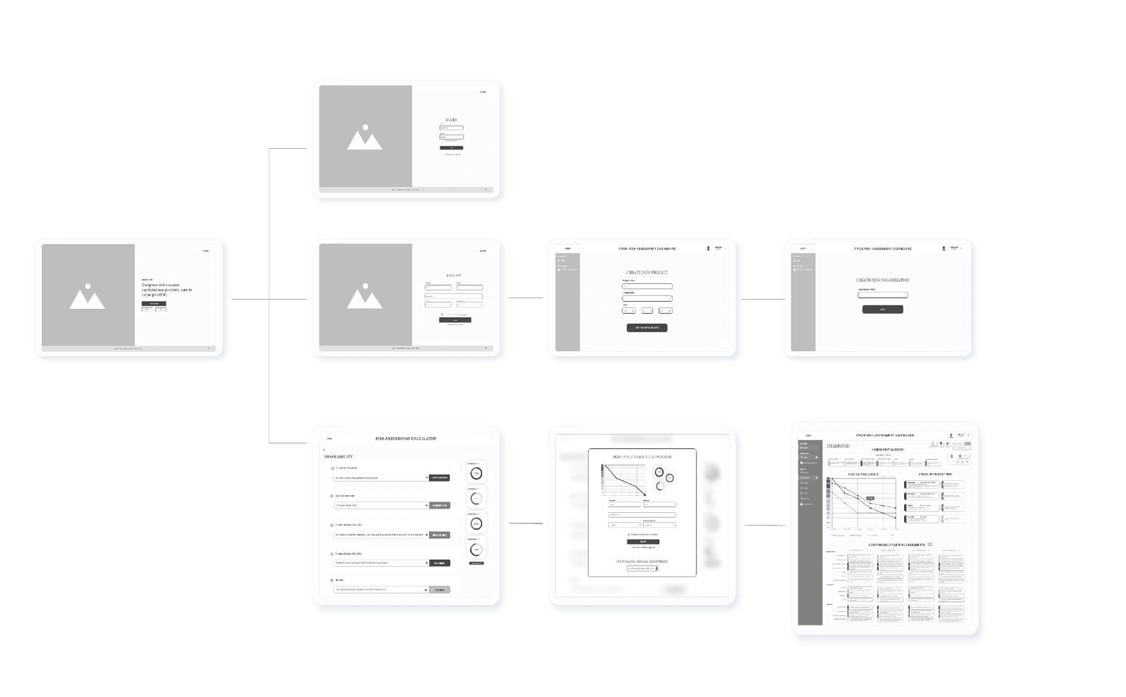
Designing the user flow for the Itron Risk Calculator required balancing simplicity with depth. The goal was to guide users through a complete evaluation process from setting up a new innovation project to scoring its risk profile and generating meaningful insights without overwhelming them. I mapped the flow into a linear yet flexible structure, allowing users to move between phases while maintaining a sense of progression. The flow prioritizes clarity, embedded guidance, and iterative engagement, aligning with how innovation teams actually work.
User type
Landing Page
Sign-up
Don’t Sign-up
Login
Risk Assessment
Calculator
Navigates to customer
profile page
Project summary
with graph
Chose Project
Project Dashboard
Home Dashboard (all data)
User fills out
assessment
Calculate/Save
Prompt Sign up modal
Calculates risk score
If user
If user
If not user
Verification
Data Input
Usage
Develop
Information Architecture
To ensure the product was intuitive and scalable, I began by designing the information architecture. I organized the content into logical categories that matched the way innovation teams approach their work, starting from project creation and assessment to execution and reporting. The hierarchy was built to reflect user mental models, helping people quickly find what they needed while reducing cognitive load. This foundation helped align stakeholders around a shared understanding of the product’s structure.
Home Dashboard
Settings
Profile
Notifications
Permissions
Projects
Trends
Portfolio Comparison
Stakeholder Management
Risk Assessment
Execution
Summary Calculation
New Project
Project Setup
Team Asignment
Risk Parameters Ovd
Wireframes
With the structure in place, I moved into wireframing to bring the layout and interactions to life. I focused on visual clarity, grouping related content, and prioritizing the most important actions on each screen. These wireframes gave the team a shared reference point for discussions, allowing us to focus on functionality and flow before getting into visual design. During this process, I also identified opportunities to streamline steps and simplify decision-making.
Usability Testing
Once the prototype was ready, I facilitated usability testing to validate the core experience and identify areas for improvement. I created a task-based script that walked users through critical interactions, such as evaluating risk and interpreting dashboard data. Test participants included both internal teams and future users of the tool. After each session, I synthesized insights into themes like confusion points, unmet expectations, and feature ideas. These findings directly informed the next round of refinements.
KICKOFF
Stage 1: Engagement & Discovery
Stage 2: SCORING
Stage 3: REVIEW
RESEARCH
INTERPRET
INPUT
SYNC WITH TEAM
PREPARE REVIEW
REVISIT SCORES
Pain Point
Misunderstanding
Save status unclear
Formula errors disrupt flow
Version control issues
Exported files corrupted
Dashboards well received
Spreadsheet overwhelming layout
Confused risk type labels
Delight
Idea
Add auto-save indicator
Real-time risk preview
Enable inline commenting
Add score history tracking
Score change
explanations unclear
Add onboarding walkthrough
Use confidence sliders
Tooltips clarified scoring
Deliver
Style Guide
Next I developed a focused design system specifically for risk assessment interfaces, ensuring consistency across the complex multi-step workflow while maintaining flexibility for future enhancements.
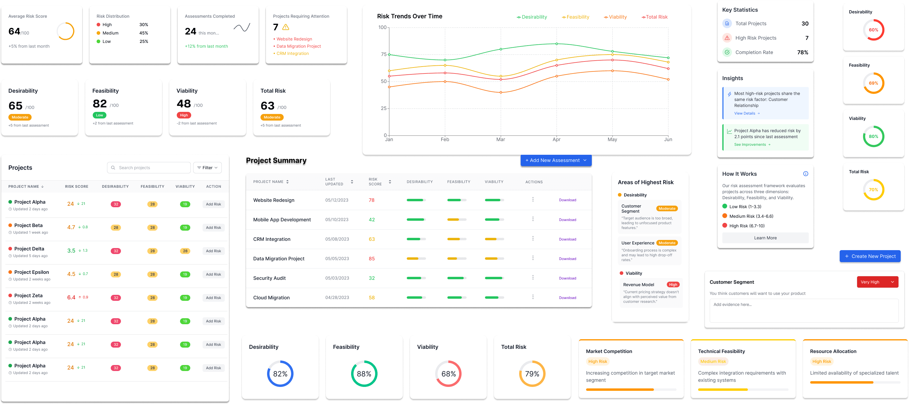
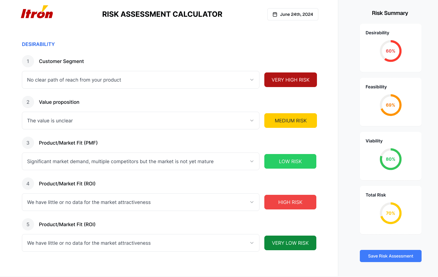
Final Designs
The entire application underwent comprehensive redesign across three core interfaces. The design evolution shows a dramatic transformation from a basic data display tool to an intuitive decision-making platform.

Optimized sidebar layout with key statistics
Enhanced numerical displays with clear risk labels
Contextual "How It Works" educational content
Comprehensive "Areas of Highest Risk" with specific insights
Enhanced insights with specific observations and trends

Clear risk level buttons with descriptive labels
Real-time risk summary sidebar with circular progress indicators
Save functionality with clear completion status
Home Dashboard
Home Dashboard
Home Dashboard
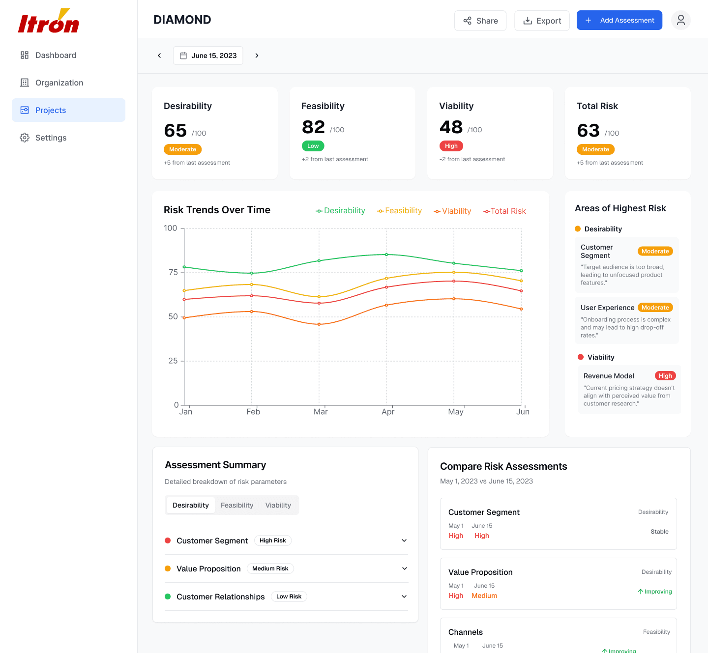
Side-by-side risk assessment comparison feature
The Itron Risk Calculator project demonstrates how thoughtful UX design can bridge the gap between sophisticated analytical frameworks and practical business application. By applying user-centered design principles to complexbusiness methodology, we achieved measurable improvements in adoption, accuracy, and business outcomes.
This project validated that users embrace sophisticated tools when complexity is revealed incrementally with clear valueat each level. The integration of education within workflow created sustainable adoption while building organizational capability.
Conclusion
"The most impactful UX work often happens in unglamorous but critical business processes where good design can unlock enormous organizational value."
Develop
User flow
Information architecture
Wireframes
Deliver
Visual design
User testing
Final Designs
Results & Impact
01 Must Haves
Smartsheet
Airtable
Lean Canvas
Stratagyzer
Vanguard
Schwab
Abstract
Competitor
Competitor
Risk Scoring
Framework
Data Input Forms
Basic Visualization
Project Tracking
User Access Control
01 Must Haves
Smartsheet
Airtable
Lean Canvas
Stratagyzer
Vanguard
Schwab
Abstract
Competitor
Competitor
Risk Scoring
Framework
Data Input Forms
Basic Visualization
Project Tracking
User Access Control
Role: UX & UI design
Tools: Figma, Anima, Spline
Team: 2 product designers and a UX researcher
Timeline: 4 months (January 2023 - April 2023)
The Problem
Itron's innovation team was evaluating 15-20 high-stakes projects quarterly, each representing $50K-$2M investments. Their Google Sheets-based risk calculator, while methodologically sound, was creating a bottleneck in the innovation pipeline. Teams were either skipping risk assessments entirely or producing unreliable results, leading to poor investment decisions and project failures.
The Goal
Redesign the experience as an interactive web app that guides users through structured risk assessments, increases team participation, and generates trackable insights over time.
The Project
Itron Idea Labs needed a standardized and intuitive tool to evaluate the risk and maturity of early-stage innovation projects. The previous Excel-based model was difficult to use and offered little visibility or consistency across teams. As the lead UX designer, I transformed the model into a user-friendly web-based tool aligned with the Business Model Canvas and grounded in real-time team usage.
6
1h
12
respondents
duration
interview questions
Walk me through your current risk assessment process from start to finish
What specific challenges do you face when using the Excel-based tool?
How do you currently share and discuss risk assessments with your team?
What would an ideal risk assessment experience look like for you?
How do you use risk data in decision-making and stakeholder presentations?
What prevents you from updating risk assessments regularly?
How confident do you feel explaining your risk scores to executives?
Bad Experience
During my interview with Alex Carter, Innovation Manager, I observed him attempt a live risk assessment using the current Excel tool. Within 15 minutes, he encountered three formula errors, had to consult external documentation twice, and ultimately abandoned the assessment in frustration. "I know my projects better than anyone," he said, "but this tool makes me question my own judgment because I can't explain how it works.
Insights
During my interviews with innovation team members, I discovered that the current Excel-based risk calculator was creating significant friction in the innovation pipeline. Users were either avoiding risk assessments entirely or producing unreliable results due to formula errors and methodology confusion.
In Depth Interviews
To uncover deeper insights into how teams actually interacted with the old spreadsheet-based tool, I conducted qualitative interviews with 6 internal innovation team leads. These were semi-structured, hour-long Zoom sessions where participants shared their screen and walked through their typical use of the tool.
User Surveys
After gathering qualitative insights through interviews, I conducted a targeted internal survey to validate patterns and better understand adoption barriers for the existing risk assessment tool. The survey was distributed to 20 Itron team members involved in innovation work, with 17 completing the questionnaire.
"Would you like to leave comments or explanations with your scores?"
Lorem ipsum dolor sit amet, consectetuer adipiscing elit.
Yes – 88%
No – 12%
“How clear is the current risk scoring system?"
Most users found the original system confusing, especially around what a score of 2 vs. 3 actually meant.
Very clear – 6%
Somewhat clear – 23%
Unclear/confusing – 71%
“Do visual dashboards and score trends help in reviews?”
100% of respondents said visualization would improve leadership understanding and meeting conversations.
Definitely
59%
41%
0%
Maybe
Not sure
"What tool format do you prefer for scoring innovation risk?"
76% of users strongly preferred a dedicated web-based tool over a spreadsheet or manual update method.
Web-based guided form
76%
18%
6%
Interactive spreadsheet
Email check-in
Define
User Persona
In order to design a tool that truly supported decision-makers in Itron’s innovation process, I created a representative user persona based on stakeholder interviews, role analysis, and behavioral patterns observed during in-depth research.
Emma Goldston
TENURE
3 Years
Venture Analyst
JOB TITLE
MBA
EDUCATION
Washington
LOCATION
“The tool treats all risks the same, but market risks are fundamentally different from technical risks. I need to tell the story of user uncertainty, not just calculate a number.”
ABOUT
NEEDS
A tool that aligns with the Business Model Canvas framework
The ability to justify risk scores to executive stakeholders
Contextual guidance when scoring high-uncertainty parameters
A dashboard that helps compare projects fairly
FRUSTRATIONS
Current tools feel like checklists, not strategic instruments
Difficulty explaining why a score changed over time
Time-consuming updates with little payoff
Lack of confidence that other teams are scoring consistently
GOALS
Make data-driven investment recommendations that stand up to executive scrutiny
Build personal credibility through consistent, defensible analysis
Stressed
Concerned
Busy
CURRENT FEELINGS
Logical
Persuasive
PERSONALITY
Detail-Oriented
STRATEGIC
Customer Journey Map
To better understand the friction points within Itron's current risk evaluation workflow, I mapped out the end-to-end journey of a core user persona through the lens of using the legacy spreadsheet tool. This journey uncovered the fragmented, manual, and cognitively demanding experience users faced when trying to translate uncertainty into standardized scores. While the existing system was rooted in a sound methodology, it lacked usability, structure, and feedback loops, resulting in skipped updates, misalignment among teams, and ultimately, unreliable data for leadership.
Phase
3
Engagement & Discovery
3
Scoring
3
Review
Actions
Emotions
Receives quarterly assessment reminder email, searches for latest Excel template, downloads multiple versions to compare
Multiple Excel versions create confusion, no clear "latest" version, file corruption issues from email attachments
47 tabs overwhelm users, methodology documentation is external and fragmented, no contextual guidance within tool
Scoring criteria are subjective and unclear, no examples or benchmarks provided, definitions require external research
Formula errors break calculations, no real-time validation, dropdown options don't match project realities
No collaborative features, email version control chaos, conflicting edits cause data loss
Must create separate presentation materials, can't explain calculation methodology to stakeholders, charts are static and unclear
Re-entry of data is tedious, no change tracking, final export often corrupted or incomplete
Provide a centralized, always-updated web version of the assessment tool
Add version history and change logs to avoid confusion with multiple copies
Embed help tooltips and links to methodology context directly in the interface
Provide a visual dashboard or map of the scoring model to reduce intimidation
Include real-world scoring examples and interactive explanations for each criterion
Use plain language to define abstract risk terms (with visual scale aids)
Implement real-time error validation and feedback for inputs
Replace static dropdowns with dynamic fields that reflect project context
Enable real-time collaboration within the tool (e.g., shared sessions, comments)
Introduce role-based access and feedback requests to consolidate input
Automatically generate visual charts, trend lines, and summary slides
Allow reviewers to toggle between high-level summaries and detailed scoring logic
Track changes over time and show a timeline of previous assessments
Use lightweight update reminders based on project changes or stakeholder input
Opens 47-tab spreadsheet, attempts to understand methodology, consults documentation PDFs, asks colleagues for guidance
Reviews scoring criteria, tries to map project details to risk parameters, second-guesses understanding of definitions
Enters risk scores in dropdown menus, encounters formula errors, manually validates calculations, saves multiple backup copies
Emails spreadsheet to team members, schedules meeting to review scores, consolidates conflicting feedback
Creates separate PowerPoint presentation, manually generates charts, prepares talking points to explain methodology
Updates assessment based on stakeholder feedback, re-validates formulas, exports final version for leadership review
Action
High Anxiety
Frustration
Medium Stress
Peak Frustration
Action
Action
Continued Anxiety
Rising Stress
Peak Stress
Declining Confidence
Kickoff
Research
Interpret
Input
Sync with team
Prepare Review
Revisit Scores
UX Scale
Context: (if applicable)
Painpoints
Opportunities
How might we help we help users navigate complex risk frameworks without overwhelming them at the outset?
Scoring criteria are unclear and highly subjective, making teams doubt the validity of their inputs.
Provide contextual guidance, examples, and confidence sliders alongside each parameter.
Teams feel overwhelmed by the 47-tab spreadsheet and often abandon the process mid-assessment.
Design a guided, step-by-step web app that reveals complexity progressively with embedded tips.
How might we help help users feel confident in their risk scores even when assessing ambiguous project factors?
Teams are forced to manually create charts and presentations after the assessment.
Introduce exportable dashboards, visualizations, and auto-generated slide decks.
How might we help users automatically generate visuals and summaries for stakeholder reporting?
The lack of collaboration features leads to conflicting versions and lost feedback.
Build real-time collaboration tools, commenting, and shared access controls into the platform.
How might we help teams work together in real time without version control chaos?
Users don’t understand how risk scores evolve over time or what has changed between versions.
Enable historical comparisons, version diffs, and change-tracking timelines for each project.
How might we help users track changes and explain shifts in risk scoring with clarity?
How Might We
Problem
Solution
Hypotheses / HMW
I used this method for focusing on specific problems and generating solutionss, and then selecting the best solutions for implementation after dot voting and prioritizing problems