Sapphire
Reserve
Email Uplift
Redesigning Chase's Welcome
and Benefits Email Experience
Role
UX Design & Email Strategy
Company
Chase · J.P Morgan
Timeline
6 months, 2024
Team
27+ cross functional partners
Problem
Chase's Sapphire Reserve
onboarding emails were
falling short of delivering
on the card's premium
brand promise, resulting in
low engagement and
missed opportunities to
reinforce value.
4.06%
Welcome
Email CTR
10.48%
Benefits Email
CTR
Objective
Redesign the welcome and benefits emails to create a seamless digital onboarding moment that reflects exclusivity and value, while improving engagement metrics.
Design Goals
01
Reinforce the Sapphire Reserve brand identity
02
Improve clarity and emotional resonance
03
Boost engagement and click-through
rates
04
Create a premium digital experience
Success Metrics
Welcome Email CTR
Target >15%
Target >25%
Benefit Emai CTR
App Downloads
Increase by 20%
J
Julia, 37
Product Strategist at Google
Profile
• Lives in NYC
• $250k income
• Wants clarity on benefits
• Doesn't want to read 10+ emails
Quote
"I just want to make sure I'm taking
advantage of everything… but I don't
want to read 10 emails to figure it out."
User Persona
Research & Insights
Users weren't just seeking information —
they were seeking reassurance. Especially
with the $550 annual fee, cardholders
needed to feel that they had made the right
choice.
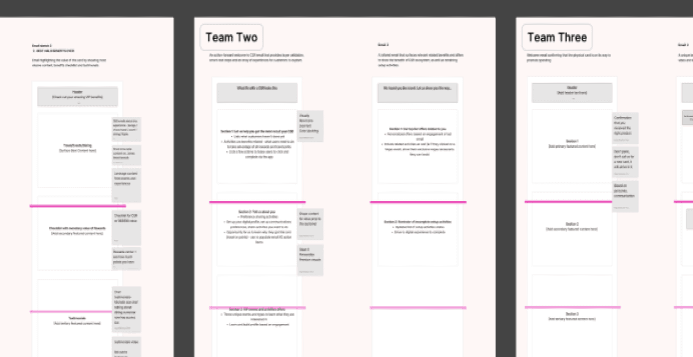
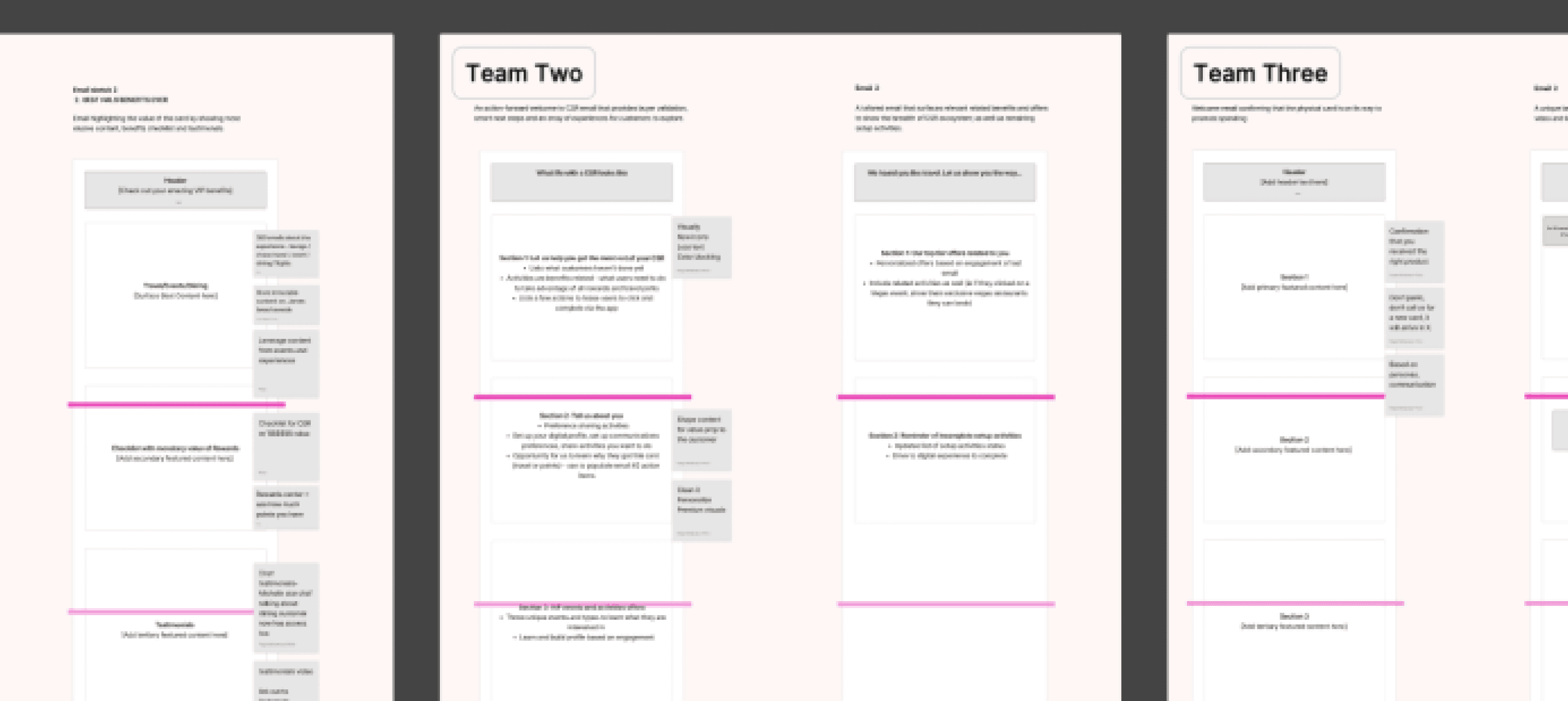
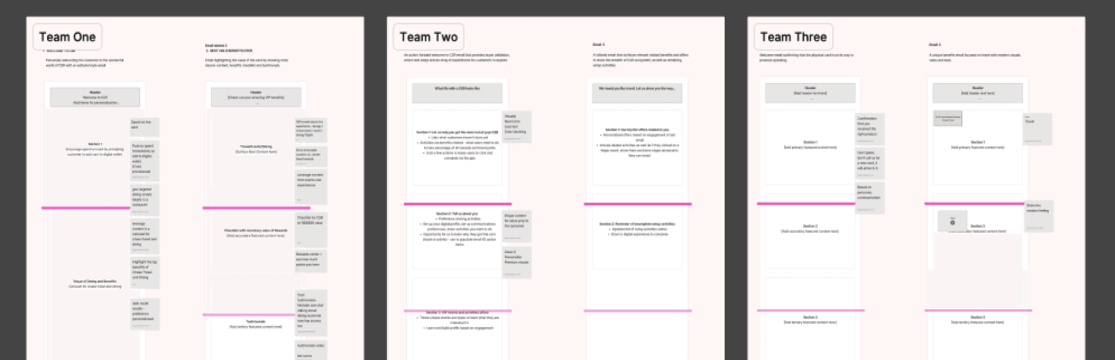
Stakeholder Workshop
I organized 27 stakeholders into 3 strategy
teams. Through collaborative exercises, we
generated 55 ideas that were synthesized
into 6 foundational design principles.
Concise Communication
Streamline content to highlight key
benefits without overwhelming users
Visual Enhancements
Use premium imagery and consistent
brand elements to elevate the experience
Targeted Personalization
Tailor content to user preferences and
behaviors when possible
Design Process
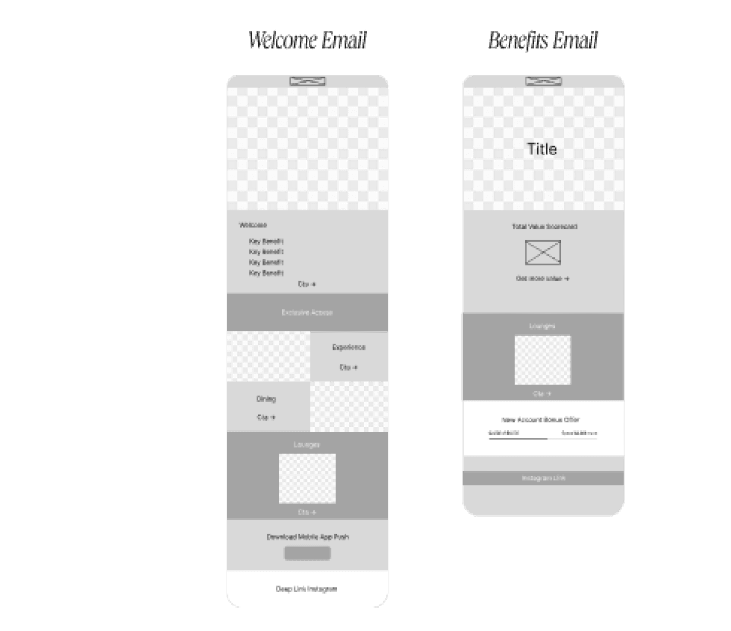
Wireframes & Concept Exploration
I created wireframes for both the welcome
and benefits emails, focusing on clear
hierarchy, digestible content sections, and
strategic CTAs.
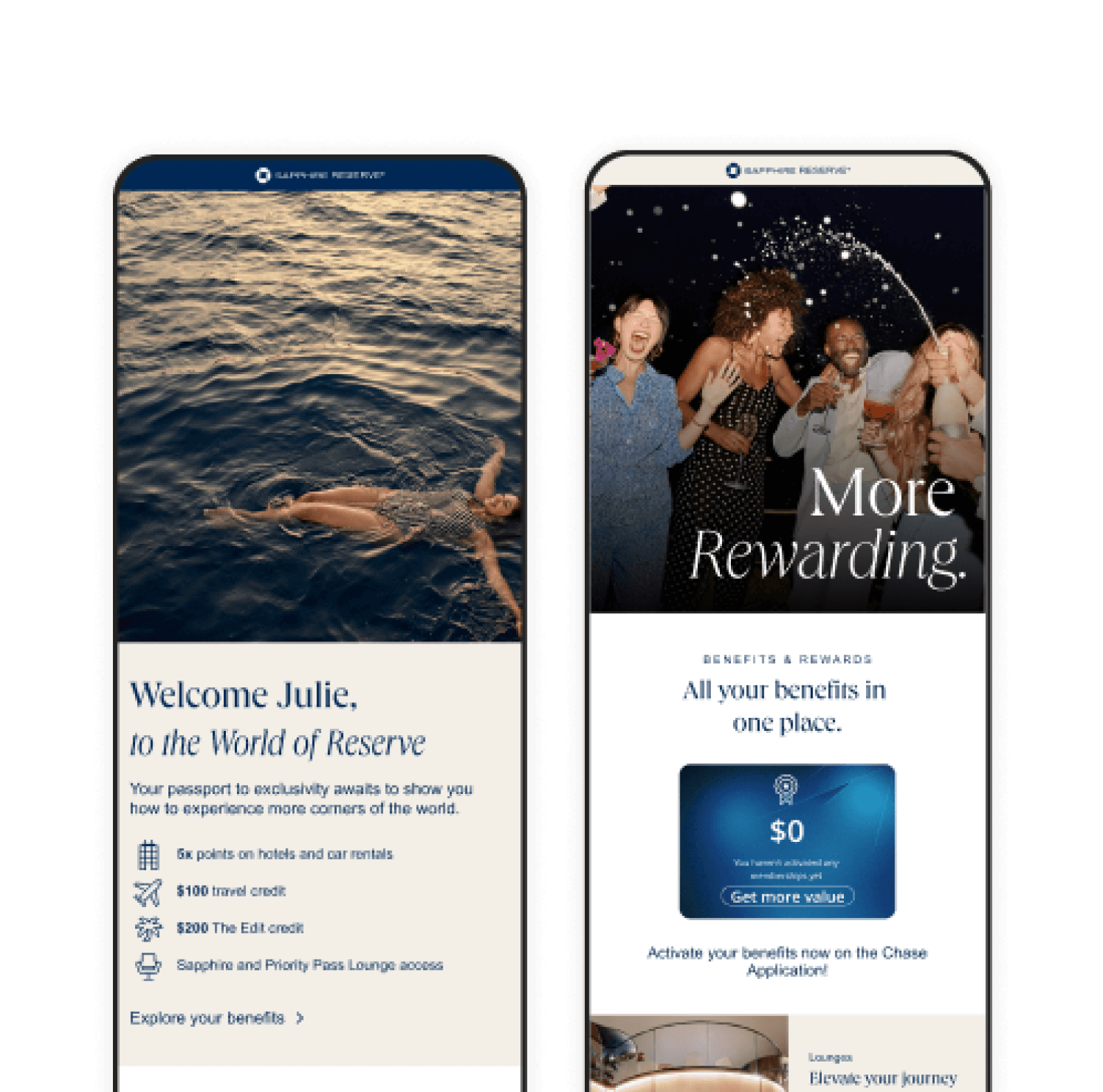
Welcome Email
Aspirational lifestyle photography
Key benefits prioritized in digestible
sections
CTA for lounge access, mobile app,
Instagram follow
Warm welcome headline: "Your passport
to exclusivity awaits"
Benefits Email
Embedded progress bar for NABO
tracking
Emotional hooks for travel, dining, and
rewards
Deep link to benefits dashboard for easy
activation

Before & After Comparison
Original Email
Redesigned Email
Final Designs
I delivered high-fidelity mobile-optimized
designs that transformed the email
experience for Sapphire Reserve
cardholders.
Brand Consistency
Aligned visual elements with Sapphire
Reserve's premium positioning through
consistent typography, color palette, and
imagery.
Mobile Optimization
Designed for mobile-first experience with
responsive layouts, touch-friendly CTAs,
and optimized image sizes.
Content Strategy
Prioritized information hierarchy with
scannable content blocks, clear benefit
explanations, and strategic CTAs.
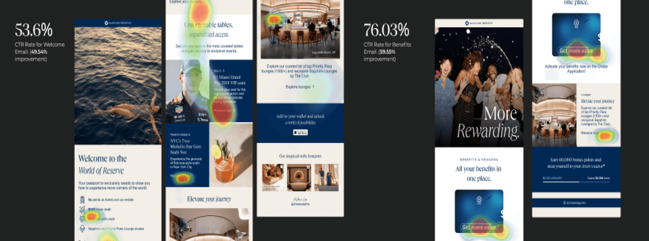
The redesigned emails significantly
improved engagement metrics and created
a more cohesive brand experience for
cardholders.
53.6%
Welcome Email CTR
↑ 49.54%
76.03%
Benefits Email CTR
↑ 59.55%
10,000+
New users received uplifted emails
Launch Success
Business Impact
Increased Engagement
Significant lift in user engagement and
app downloads, driving deeper product
adoption
Aligned Stakeholders
Created consensus on long-term brand-
consistent strategy for digital
communications
Improved Customer Experience
Enhanced the premium feel of the
onboarding journey, reinforcing value
proposition
Key Takeaways
01
Email as Brand Touchpoint
Email design is a critical
touchpoint in premium product
experiences and should reflect
the brand's positioning
consistently across all
communications.
02
Cross-functional Collaboration
Organizing 27+ stakeholders into
focused strategy teams was
essential for aligning business
goals with customer needs and
achieving consensus.
03
Emotional Resonance
For premium products, emotional
reassurance and value
justification are as important as
information delivery in customer
communications.
Reflection
"Premium experiences
aren't just about what
you offer—they're about
how you make people
feel about what they've
chosen."
This project reinforced that in
premium products, every
touchpoint is an opportunity to
either reinforce or undermine
the value proposition. By
transforming a simple email
into a moment of delight and
reassurance, we not only
improved engagement metrics
but strengthened the
emotional connection between
customers and the brand. The
systematic approach to
stakeholder alignment and
modular design thinking
proved crucial for scaling the
solution across the broader
email ecosystem.
Sapphire Reserve Email Uplift
Redesigning Chase's Welcome and Benefits Email Experience
Role
UX Design & Email
Strategy
Company
Chase · J.P. Morgan
Timeline
6 months, 2024
Team
27+ cross-
functional partners
J
Julia Chen
Product Strategist,
37
San Francisco, CA
Demographics
• Income: $250k+
• Travel: 8-12
trips/year
• Tech-savvy early
adopter
• Values efficiency
& quality
Goals &
Motivations
• Maximize card
benefits
• Streamline travel
experience
• Justify annual fee
investment
• Maintain premium
lifestyle
Pain Points
• Information
overload
• Unclear benefit
activation
• Generic
communications
• Time constraints
Chase's Sapphire Reserve onboarding emails were falling short of
delivering on the card's premium brand promise, resulting in low
engagement and missed opportunities to reinforce value.
4.06%
Welcome Email CTR
10.48%
Benefits Email CTR
Objective
Redesign the welcome and benefits emails to create a seamless digital
onboarding moment that reflects exclusivity and value, while improving
engagement metrics.
Design Goals
01
Reinforce the Sapphire Reserve
brand identity
02
Improve clarity and emotional
resonance
03
Boost engagement and click-through
rates
04
Create a premium digital experience
Success Metrics
Welcome Email CTR
Target: >15%
Benefits Email CTR
Target: >25%
App Downloads
Increase by 20%
NABO Redemption
Improve activation
User Persona
Research & Insights
Users weren't just seeking information — they were seeking reassurance.
Especially with the $550 annual fee, cardholders needed to feel that they had
made the right choice.
Stakeholder Workshop
I organized 27 stakeholders into 3 strategy teams. Through collaborative exercises, we
generated 55 ideas that were synthesized into 6 foundational design principles.
Concise
Communication
Streamline content to
highlight key benefits
without overwhelming
users
Visual
Enhancements
Use premium imagery
and consistent brand
elements
Targeted
Personalization
Tailor content to user
preferences and
behaviors
Increased
Transparency
Clearly communicate
value proposition and
activation steps
Strategic Cross-sell
Introduce
complementary
products and services
Increased
Engagement
Design clear CTAs and
interactive elements
Design Process
Wireframes & Concept Exploration
I created wireframes for both the welcome and benefits emails, focusing on clear hierarchy,
digestible content sections, and strategic CTAs.
Welcome Email
Aspirational lifestyle photography
Key benefits prioritized in digestible
sections
CTA for lounge access, mobile app,
Instagram follow
Warm welcome headline: "Your passport
to exclusivity awaits"
Benefits Email
Embedded progress bar for NABO
tracking
Emotional hooks for travel, dining, and
rewards
Deep link to benefits dashboard for easy
activation

Final Designs
I delivered high-fidelity mobile-optimized designs that transformed the email experience for Sapphire Reserve cardholders.
Brand Consistency
Aligned visual elements
with Sapphire Reserve's
premium positioning
through consistent
typography, color
palette, and imagery.
Mobile Optimization
Designed for mobile-first
experience with
responsive layouts,
touch-friendly CTAs, and
optimized image sizes.
Content Strategy
Prioritized information
hierarchy with scannable
content blocks, clear
benefit explanations,
and strategic CTAs.
The redesigned emails significantly improved engagement metrics and created a more cohesive brand experience for cardholders.
53.6%
Welcome Email CTR
↑ 49.54%
76.03%
Benefits Email CTR
↑ 59.55%
10,000+
New users received
uplifted emails
Launch Success

Business Impact
Increased Engagement
Significant lift in user
engagement and app
downloads, driving deeper
product adoption
Aligned Stakeholders
Created consensus on long-
term brand-consistent
strategy for digital
communications
Improved Customer
Experience
Enhanced the premium feel
of the onboarding journey,
reinforcing value proposition
Reflection
"Premium experiences aren't just about what you offer—they're
about how you make people feel about what they've chosen."
This project reinforced that in premium products, every touchpoint is an
opportunity to either reinforce or undermine the value proposition. By
transforming a simple email into a moment of delight and reassurance, we not
only improved engagement metrics but strengthened the emotional connection
between customers and the brand. The systematic approach to stakeholder
alignment and modular design thinking proved crucial for scaling the solution
across the broader email ecosystem.
Before & After Comparison
Original Email
Redesigned Email
Key Takeaways
01
Email as Brand Touchpoint
Email design is a critical touchpoint in premium product experiences and should
reflect the brand's positioning consistently across all communications.
02
Cross-functional Collaboration
Organizing 27+ stakeholders into focused strategy teams was essential for aligning
business goals with customer needs and achieving consensus.
03
Emotional Resonance
For premium products, emotional reassurance and value justification are as
important as information delivery in customer communications.
Sapphire Reserve Email Uplift
Redesigning Chase's Welcome and Benefits Email Experience
Role
UX Design & Email Strategy
Company
Chase · J.P. Morgan
Timeline
6 months, 2024
Team
27+ cross-functional partners
Problem
Chase's Sapphire Reserve onboarding emails were falling short of delivering on the card's premium brand promise. The original emails were creating a disconnect between the product's positioning and the customer's first digital experience.
4.06%
Welcome Email Click-Through Rate
10.48%
Benefits Email Click-Through Rate
Objective
Redesign the welcome and benefits emails to create a seamless digital onboarding moment that reflects
exclusivity and value, while improving engagement metrics.
Design Goals
01
Reinforce the Sapphire Reserve brand identity
02
Improve clarity and emotional resonance
03
Boost engagement and click-through rates
04
Create a premium digital experience
Success Metrics
Welcome Email CTR
Target: >15%
Benefits Email CTR
Target: >25%
App Downloads
Increase by 20%
NABO Redemption
Improve activation
Research & Insights
Users weren't just seeking information — they were seeking reassurance. Especially with the $550 annual fee,
cardholders needed to feel that they had made the right choice.
User Persona
Stakeholder Workshop
I organized 27 stakeholders into 3 strategy teams. Through collaborative exercises, we generated 55 ideas that were synthesized into 6 foundational design principles.
J
Julia Chen
Product Strategist, 37
San Francisco, CA
Demographics
• Income: $250k+
• Travel: 8-12 trips/year
• Tech-savvy early adopter
• Values efficiency & quality
Goals & Motivations
• Maximize card benefits
• Streamline travel
experience
• Justify annual fee
investment
• Maintain premium lifestyle
Pain Points
• Information overload
• Unclear benefit activation
• Generic communications
• Time constraints
Concise Communication
Streamline content to highlight key
benefits without overwhelming users
Visual Enhancements
Use premium imagery and consistent
brand elements
Targeted Personalization
Tailor content to user preferences
and behaviors
Increased Transparency
Clearly communicate value
proposition and activation steps
Strategic Cross-sell
Introduce complementary products
and services
Increased Engagement
Design clear CTAs and interactive
elements
Design Process
Wireframes & Concept Exploration
I created wireframes for both the welcome and benefits emails, focusing on clear hierarchy, digestible content
sections, and strategic CTAs.
Welcome Email
Aspirational lifestyle photography
Key benefits prioritized in digestible sections
CTA for lounge access, mobile app, Instagram follow
Warm welcome headline: "Your passport to exclusivity awaits"
Benefits Email
Embedded progress bar for NABO tracking
Emotional hooks for travel, dining, and rewards
Deep link to benefits dashboard for easy activation
Before & After Comparison
Original Email
Redesigned Email
Business Impact
Increased Engagement
Significant lift in user engagement and
app downloads, driving deeper product
adoption
Aligned Stakeholders
Created consensus on long-term brand-
consistent strategy for digital
communications
Enhanced Experience
Reinforced premium positioning and
justified the $550 annual fee investment
53.6%
Welcome Email CTR
↑ 49.54%
76.03%
Benefits Email CTR
↑ 59.55%
10,000+
New users received uplifted
emails
Launch Success
Key Takeaways
01
Email as Brand Touchpoint
Email design is a critical touchpoint in premium product experiences and should reflect the brand's positioning
consistently across all communications.
02
Cross-functional Collaboration
Organizing 27+ stakeholders into focused strategy teams was essential for aligning business goals with customer
needs and achieving consensus.
03
Emotional Resonance
For premium products, emotional reassurance and value justification are as important as information delivery in
customer communications.
Reflection
"Premium experiences aren't just about what you offer—they're about how you make people
feel about what they've chosen."
This project reinforced that in premium products, every touchpoint is an opportunity to either reinforce or undermine
the value proposition. By transforming a simple email into a moment of delight and reassurance, we not only
improved engagement metrics but strengthened the emotional connection between customers and the brand. The
systematic approach to stakeholder alignment and modular design thinking proved crucial for scaling the solution
across the broader email ecosystem.
Final Designs
I delivered high-fidelity mobile-optimized designs that transformed the email experience for Sapphire Reserve
cardholders.
Brand Consistency
Aligned visual elements with
Sapphire Reserve's premium
positioning through consistent
typography, color palette, and
imagery.
Mobile Optimization
Designed for mobile-first
experience with responsive
layouts, touch-friendly CTAs,
and optimized image sizes.
Content Strategy
Prioritized information
hierarchy with scannable
content blocks, clear benefit
explanations, and strategic
CTAs.
